Deprivation tool

We think impact is more important than output.

Many organisations now measure ‘Social Value’ but we ask what does that really mean for communities, particularly in the more deprived areas of the UK?  Our deprivation mapping module allows clients to show the real impact of their policies and processes where it matters most.
Gathering and processing information.

We take the whole of a clients purchase ledger,  together with any other data if they wish that they may have gathered from their supply chain, for example labour numbers, or apprenticeships.  Then we clean this data and map it against a range of underlying maps.

Deprivation image 1

Areas of Deprivation

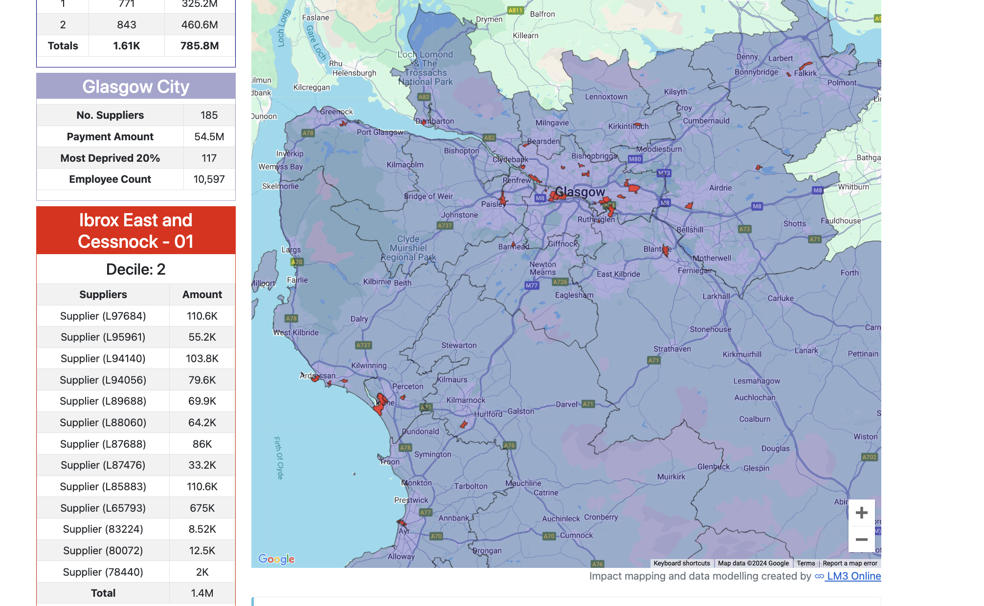
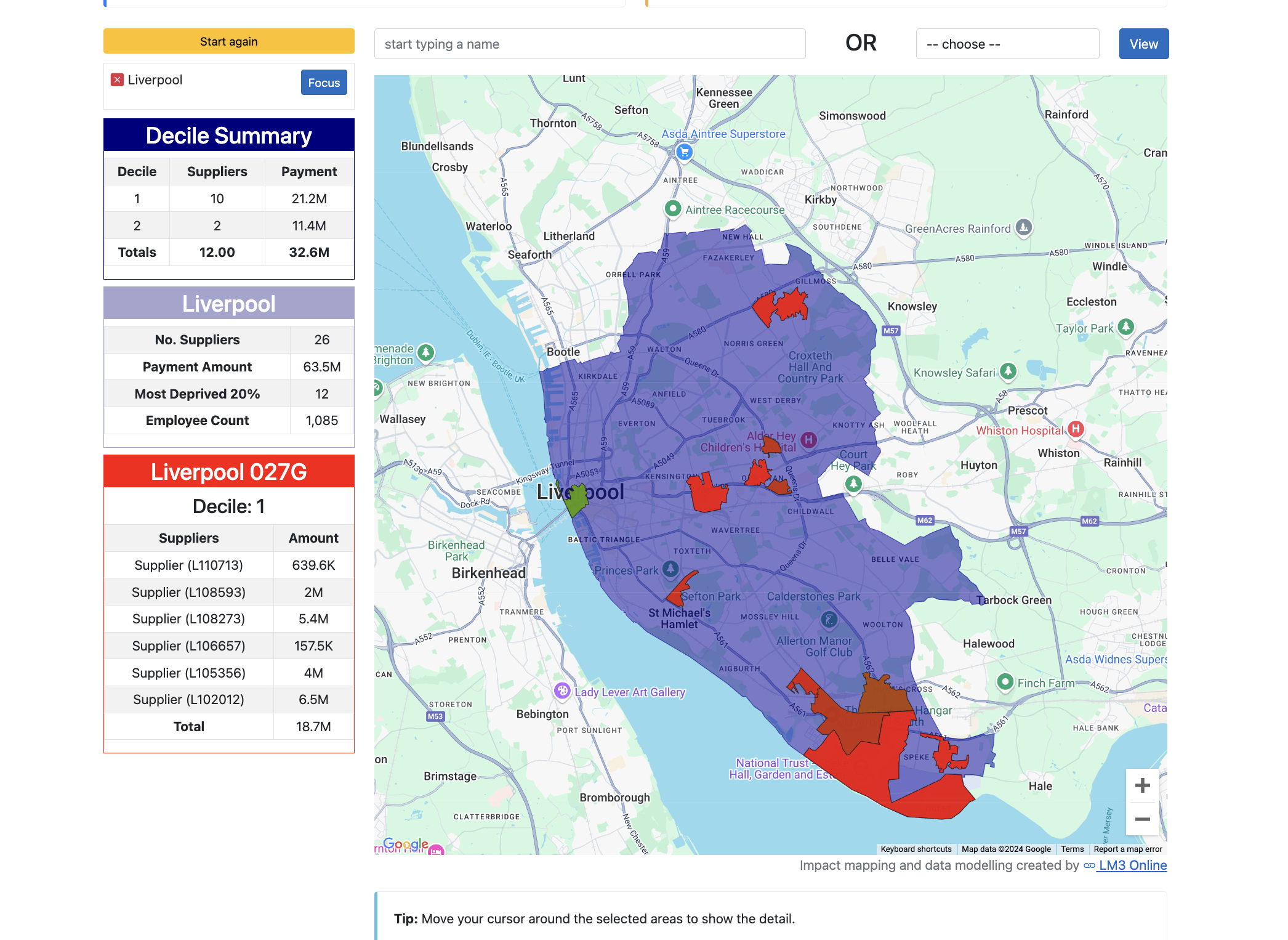
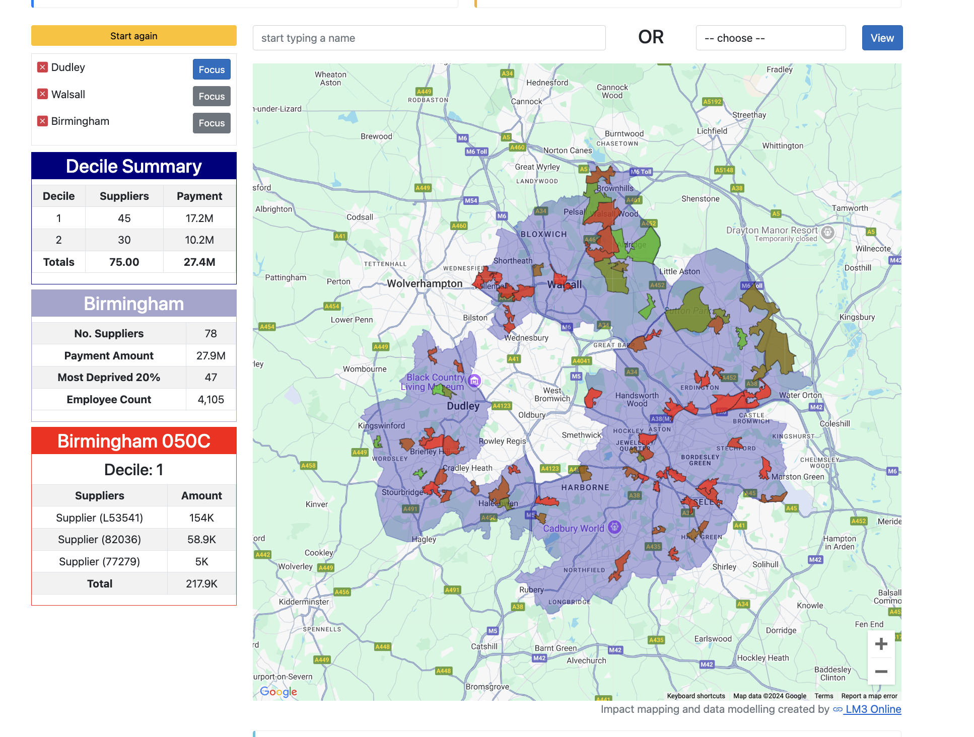
We can use a number of different maps but a good example is the index of multiple deprivation.  This divides the UK up into about 30,000 areas and ranks these from the most deprived (decile 1) to least deprived (decile 10).  We can then show how much impact you are having where it matters.

Interactive and dynamic

The result is an interactive and dynamic tool that allows you to select areas such as Birmingham and build up a map changes as use move your cursor over the deprived areas showing the impact you are having.  At the same time you can see a summary of the total UK impact using multipliers derived from ONS data what the total economic impact of your supply chain is on the UK economy in general and deprived areas in particular.

Interactive and Dynamic

If you need more information or have any questions don’t hesitate to contact us directly.

Contact Us
partner logo | Morgan Sindall
partner logo | Wellcome
partner logo | kier
partner logo | edf